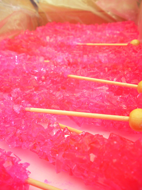
Ever since I opened this…

…(an awesome box of candy up for an upcoming wedding and Sugar Bar!), I have had hot, hot pink design on the brain! And, conveniently and not intentionally at all (seriously), it’s Valentine’s Day!
For me, I love it when a really bright colour design is used in a bold, monochromatic way so that there is no other competition yet there is still dimension and texture within one colour. I’ve grabbed some beautiful examples of how I would use a bold colour (in this case, hot pink) in a monochromatic fashion for designing a high-impact wedding!
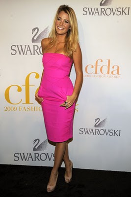
Perhaps a little out-there for a bridesmaid dress choice, but I really like this dress on actress Blake Lively for a modern wedding: simple lines, clean with no frills…just a great pop of colour!

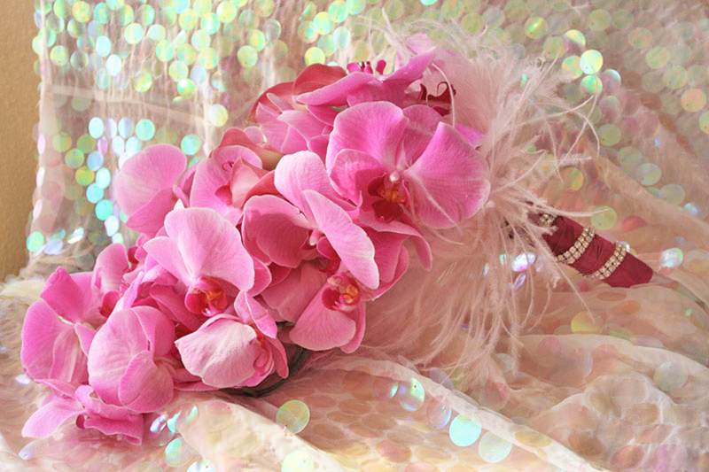
I also love the monochromatic bouquet in hot pink…but with ZERO greenery so that it stays really modern! The geniuses Aileen and Karen Tran create my favourite floral designs for these kind of bouquets:

This one isn’t “hot” pink, but it was too perfect “ballet” pink to leave out:

This is a Colin Cowie “baroque” design, with a bevy of flowers to create a dramatic wedding aisle. Again, I prefer no greenery or very little greenery in my florals for something this bold, but who am I to dispute with Colin Cowie?

Photo via One Wed
However, something I can definitely, full-heartedly declare my love for is Colin Cowie’s hot pink dessert bar he created for Barbie’s 50th birthday party! So bright and over-the-top, just like Barbie…

Photo via Hostess with the Mostess Blog
Working with a smaller budget than Barbie? Try these pink cake pops that just as sweet! The pink sanding sugar adds a great touch.

Photo via herBOLD Events
Finally, for the really bold: a pink, monochromatic reception, where everything is swimming in pink. Wow does this ever pack a punch — so exquisite!

Photo via Wedding Trends
Okay. I’m falling off the map here because this last photo from Southern Weddings isn’t monochromatic pink, but if Sweet Stylings Event Design was a wedding, this would be it!

Purple linens? Chiavari chairs? Orchids and peonies and hydrangeas? Yes, yes, yes!
I understand that this is a look that is not for everyone (and the Mr. might oppose to that much pink). I admit that I can be a bit of a colour-a-phobe, but these photos are really convincing me that having a strong, monochromatic scheme is a really bold statement that can look very sophisticated, and not just “Barbie”-like, when done correctly. I feel that the trouble begins when there are too many competing elements, such as if you have a lot of different colours goin’ on, and have large tables combined with chunkier chairs or chair covers with sashes — that’s when it can get too much if everything is pink (or any other colour for that matter). Hopefully these photos have inspired you to consider a bolder design than you were initially thinking of — I’m still working on getting colour into my house!


